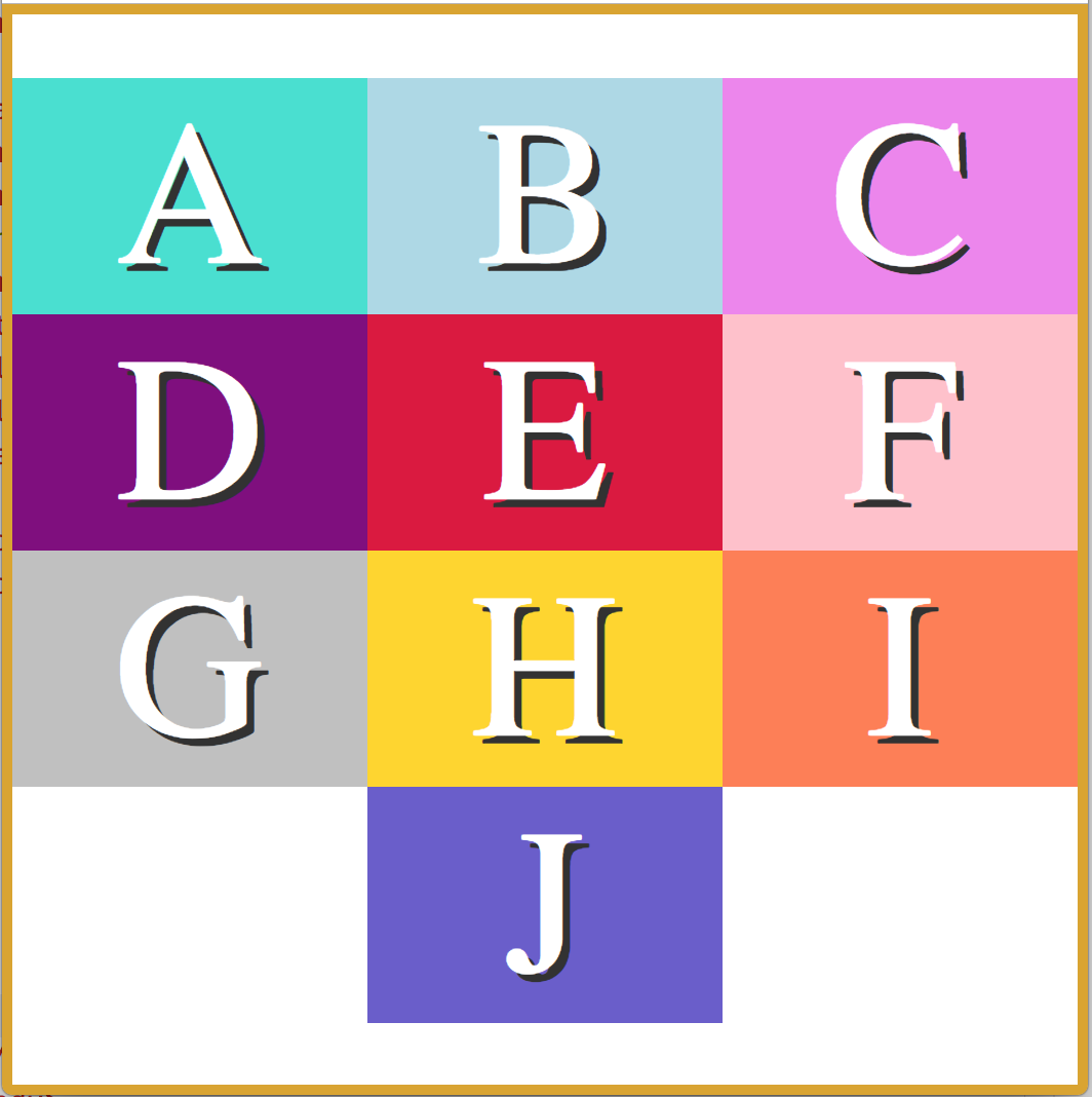
Flexbox is an amazing tool for website layout.
It alleviates many issues that have existed since the beginning of CSS.
Flexbox helps to accomplish the following:
Flexbox works by applying CSS properties to both the container, and the children inside the container.
display:flex; to the container of the items you intend to arrange.display:flex arranges your items in a row. This can be changed with flex-direction: column
 .container {
  display: flex;
  flex-direction: row;
}
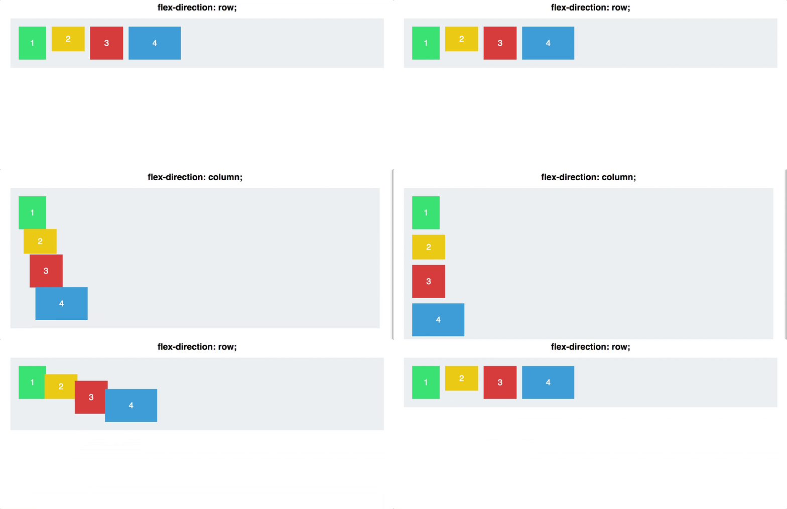
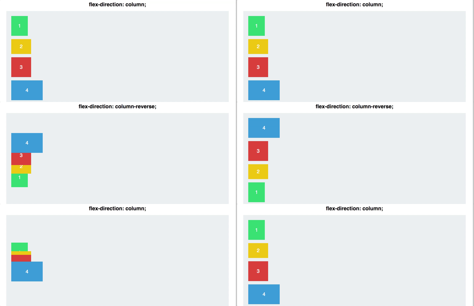
flex-direction: column-reverse;flex-direction: row-reverse
#container {
  display: flex;
  flex-direction: column-reverse;
}
Justifying your content, both horizontally and vertically, used to be a very large pain in the neck.
Not anymore! Flexbox makes this easy, with one simple line of CSS. There are 5 different values for the CSS property justify-content:
#container {
  display: flex;
  justify-content: center;
}
Justify content is applied to the flex container as well. It works along the main axis of the flex container, and does the following:
align-items is also applied to the flex container. This is similar to justify content, but works along the cross-axis. If your items are arranged in a row, this would act on the vertical axis.
align-items are:#container {
display: flex;
align-items: stretch;
}
align-items: stretch, any height values for the children inside the flex container will override this functionality.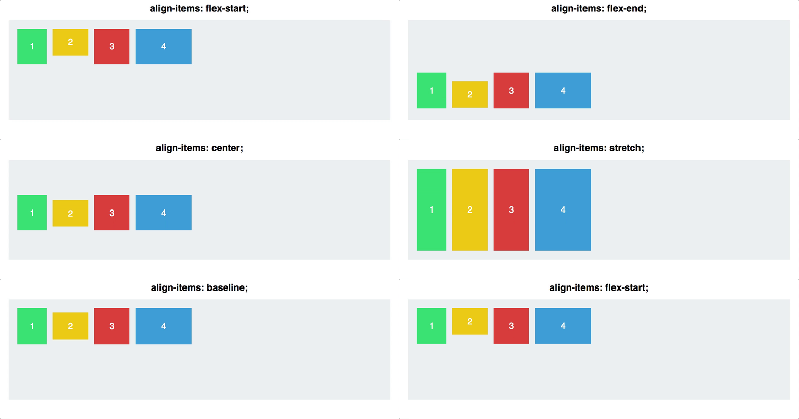
flex-direction:column and flex-direction:row
#container {
  display: flex;
  flex-direction: row;
}

NOTE: if you want your items to be columns, use
flex-direction: rowin the container, and if you want rows, useflex-direction: columnin the container
Want to switch the first two navigation items on your website? First the container must have the property display: flex;.
Then give the first item order: 2, and the second item order: 1.
(Note that the default value is 0, so all items will need to be given an order number.)
.firstItem {
  display: flex;
  order: 1;
}

.secondItem {
  display: flex;
  order: 2;
}
This is ground breaking. Never before were we able to rearrange the order of elements on a website with pure CSS.
align-items, and achieves the same results, but for individual items:.navigationBarItem0 {
display: flex;
align-self: flex-start;
}

Q: What do you get when you put a Flexbox inside a Flexbox?
A: A grid! (But not CSS Grid)
<div class='two-columns'>
  <div class='column'>
    <h2>Meats</h2>
    <div>Turkey</div>
    <div>Ham</div>
  </div>
  <div class='column'>
    <h2>Cheeses</h2>
    <div>Cheddar</div>
    <div>Swiss</div>
    <div>American</div>
  </div>
</div>

<style>
.two-columns {
    display: flex;
    flex-direction: row;
}

.column {
    display: flex;
    flex-direction: column;
}
</style>
1/13