CSS Layout

(CSS is Awesome mug created by Steven Frank, still available for purchase on Zazzle)

(CSS is Awesome mug created by Steven Frank, still available for purchase on Zazzle)
This is where things start to get a little bit tricky - positioning HTML elements using CSS.
There are two main display rules (or "levels") for HTML elements.
Inline elements should only contain data, or other inline elements.
Block level elements can contain both block and inline elements.

Elements are given a default display value based on their type - this is a CSS property that determines an element's layout, and how it interacts with other elements.
display: block;
display: inline;
display: inline-block
display: none;
See https://developer.mozilla.org/en-US/docs/Web/CSS/display for many more display values.
Inherent display properties of commonly-used HTML elements.
| Block Level Elements |
|---|
| div |
| p |
| table |
| form |
| ul, ol |
| nav |
| Inline Elements |
|---|
| span |
| a |
| i, em |
| b, strong |
| img |
| button |
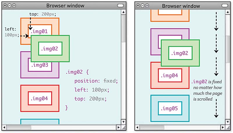
There are 4 commonly-used position properties in CSS. These further help to position elements on a page. They also help to further confuse you as a developer.
top:20px; will move a relatively positioned element 20 pixels from its natural postioning.position: fixed example: 
In order to make content layout work in CSS, you often need to introduce wrapper divs.
For example, if you have an image with its own caption, and you want them to appear together and also have the caption positioned relative to the image, you might need to change this:
<img src='cow.jpg'>
<p class='caption'>This is a cow.</p>
Into this:
<div class='image-wrapper'>
  <img src='cow.jpg'>
  <p class='caption'>This is a cow.</p>
</div>

<style>
  .image-wrapper {
    position: relative;
  }
  .image-wrapper .caption {
    position: absolute;
    bottom: 0;
    margin: auto;
  }
</style>
<style>
  .image-wrapper {
    position: relative;
    float: left;
  }
</style>
Now the caption can be as wide as its parent (the wrapper), since its parent is only as wide as its content (the image).
| Float Properties |
|---|
| left |
| right |
float:left; to an element will force that element to the left side of the container, and all other elements will 'wrap' around it.
TIP: applying
clear: bothto an element will make it skip down the page past all floats, left and right. This is usually done to a<br>
YouTube user: tobyonline; Published on Dec 19, 2013; https://youtu.be/xara4Z1b18I
float property should only be used for wrapping text around images, which was its original purpose - gone are the days of CSS layout using floats.Do these tutorials:
/