Topics
CSS-FlexboxSlides
Flexbox
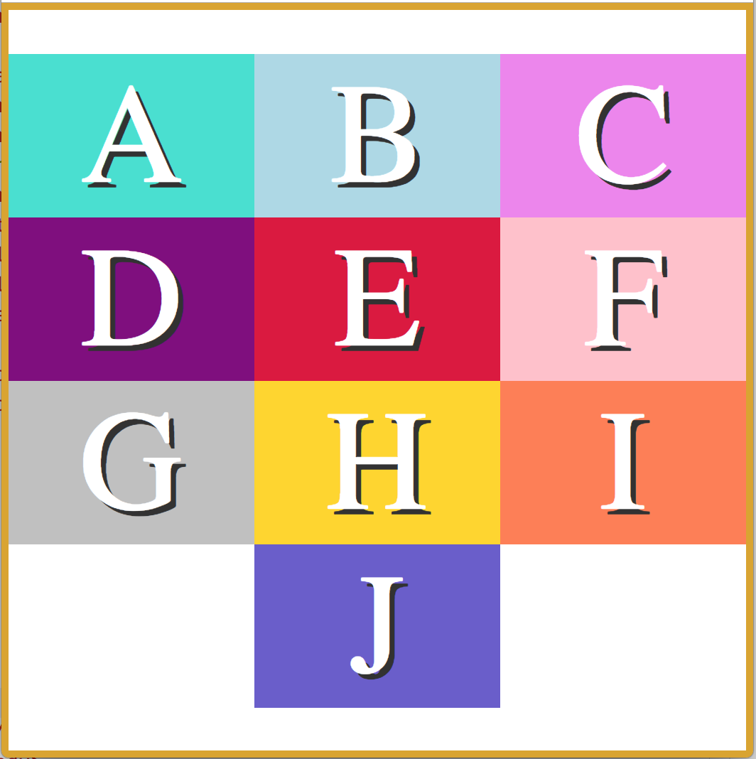
Introduction to Flexbox
Flexbox is an amazing tool for website layout.
It alleviates many issues that have existed since the beginning of CSS.
Flexbox helps to accomplish the following:
- Horizontal or vertical alignment of elements
- Arrangement (order) of elements
- Space distribution between elements
- Space distribution around elements
Notes to Remember
- Flexbox is one-dimensional. It can arrange items either in a row, or a column, but not both at the same time.
- Flexbox is useful for laying out elements such as navigation bars, headers, image galleries, etc.
- Flexbox fixes CSS layout madness by placing the responsibility for layout with the container, and not asking each item to be responsible for laying itself out
The Flex Container
Flexbox works by applying CSS properties to both the container, and the children inside the container.
- First: add the CSS property
display:flex;to the container of the items you intend to arrange. - Remember, Flexbox is one dimensional.
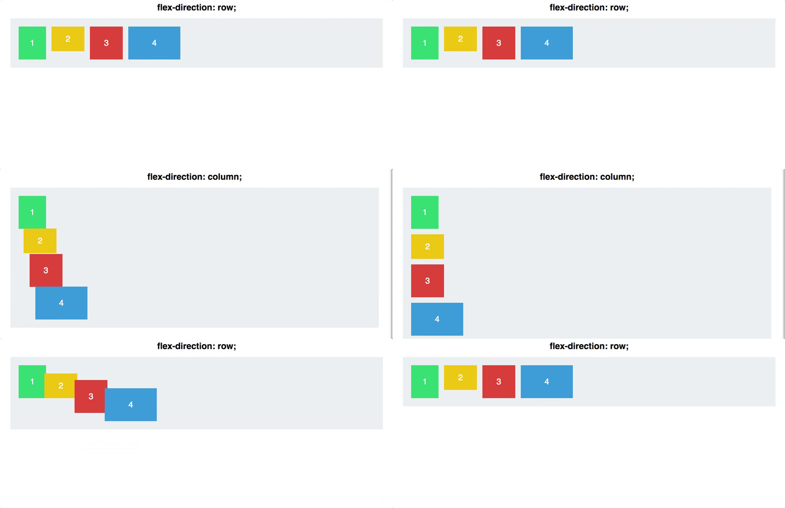
display:flexarranges your items in a row. This can be changed withflex-direction: column
Example
 .container {
  display: flex;
  flex-direction: row;
}
Reversing the Order
- Until now, re-arranging items with pure CSS was not possible.
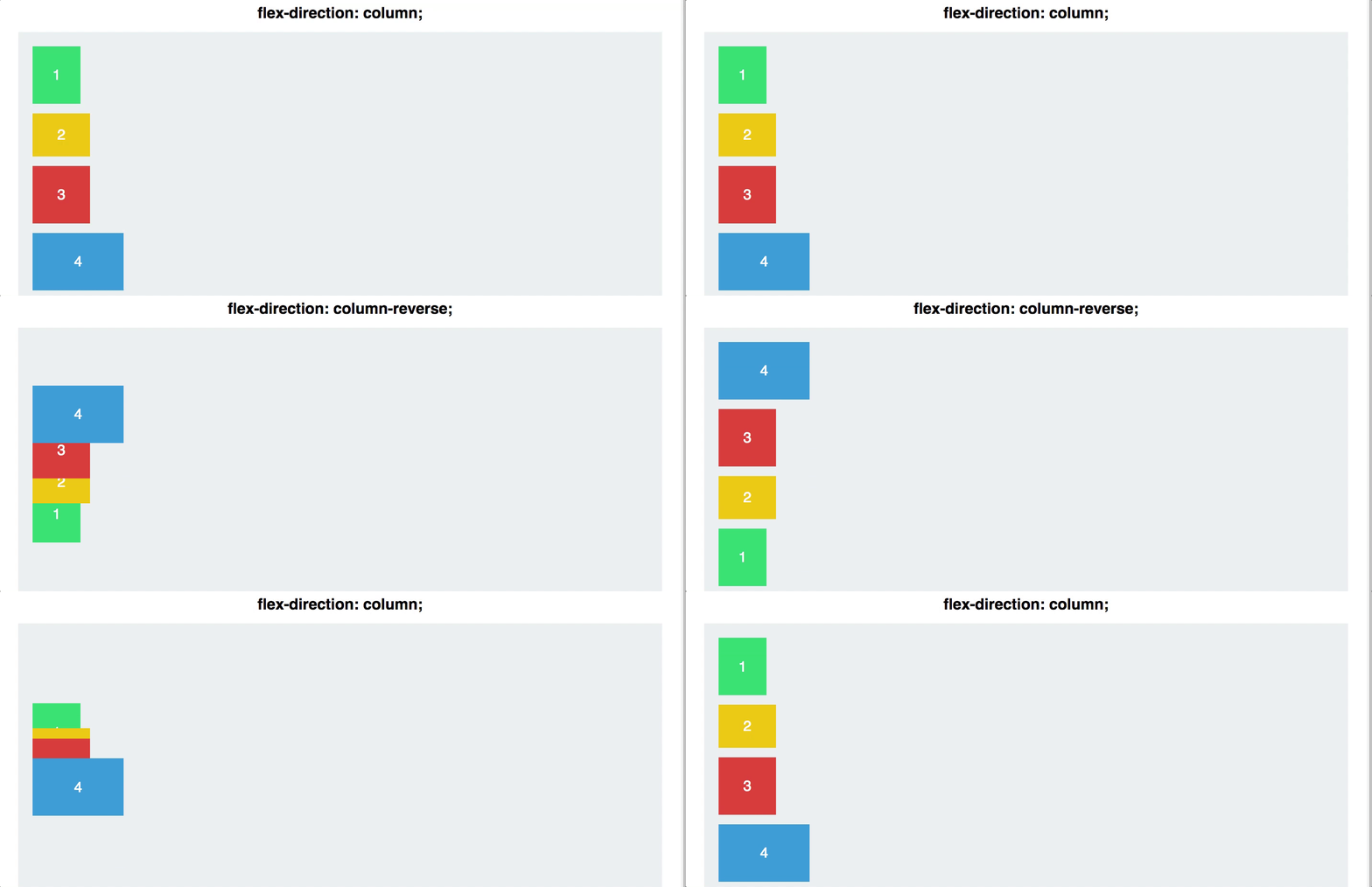
- With Flexbox, you can reverse the order of your row or column with a single directive!
- On the flex container, use
flex-direction: column-reverse;- or
flex-direction: row-reverse
Example
#container {
  display: flex;
  flex-direction: column-reverse;
}
Justify Content
Justifying your content, both horizontally and vertically, used to be a very large pain in the neck.
Not anymore! Flexbox makes this easy, with one simple line of CSS. There are 5 different values for the CSS property justify-content:
- Flex-start
- Flex-end
- Center
- Space-between
- Space-around
Example For Centering Content
#container {
  display: flex;
  justify-content: center;
}
-
Justify contentis applied to the flex container as well. It works along the main axis of the flex container, and does the following:

Align Items
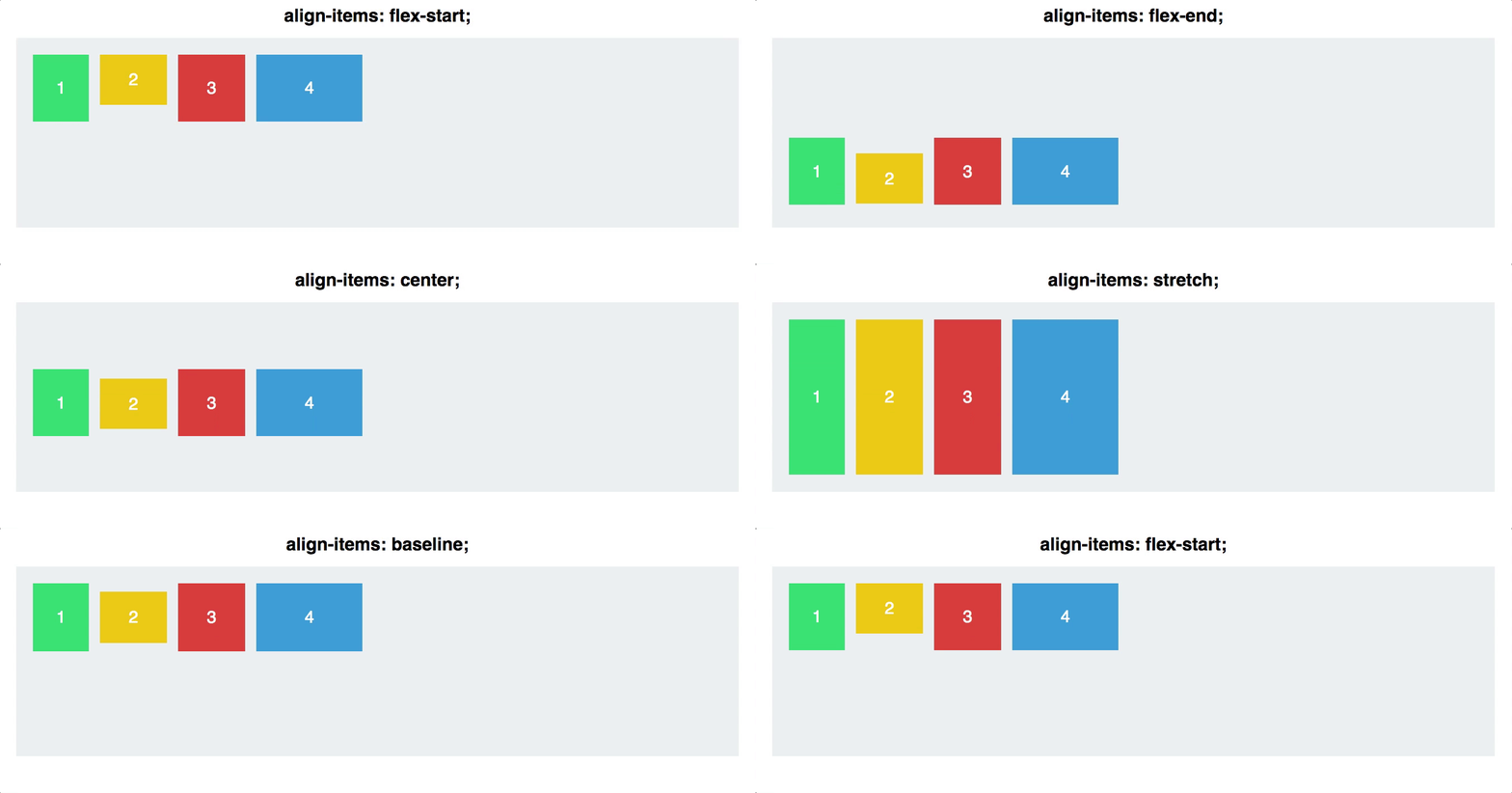
align-items is also applied to the flex container. This is similar to justify content, but works along the cross-axis. If your items are arranged in a row, this would act on the vertical axis.
- Align items allow you to fill the container vertically, or align it along the baseline of the flex container (bottom edge). Before Flexbox, this was very difficult to do.
- The five values for
align-itemsare:
- flex-start
- flex-end
- center
- stretch
- baseline
Example
#container {
  display: flex;
  align-items: stretch;
}
- Note that if you use
align-items: stretch, any height values for the children inside the flex container will override this functionality.
Flex Direction
- As we covered earlier, your flex items can be arranged either in a row, or a column. This is done with either
flex-direction:columnandflex-direction:row
Example
#container {
  display: flex;
  flex-direction: row;
}

NOTE: if you want your items to be columns, use
flex-direction: rowin the container, and if you want rows, useflex-direction: columnin the container
Controlling Individual Flex Items
- You can also apply specific Flexbox properties to individual flex items, not just the flex container. There are a number of fairly advanced properties, but we will cover the most useful ones here.
Order
- This is a fairly simple property that accepts integer values for ordering items.
Want to switch the first two navigation items on your website? First the container must have the property display: flex;.
Then give the first item order: 2, and the second item order: 1.
(Note that the default value is 0, so all items will need to be given an order number.)
Example
.firstItem {
  display: flex;
  order: 1;
}

.secondItem {
  display: flex;
  order: 2;
}
This is ground breaking. Never before were we able to rearrange the order of elements on a website with pure CSS.
Align Self
- You can also align individual items, rather than all flex items at once. This property accepts the same values as
align-items, and achieves the same results, but for individual items:
- flex-start
- flex-end
- center
- stretch
- baseline
Example
.navigationBarItem0 {
  display: flex;
  align-self: flex-start;
}

Flexi-grid
Q: What do you get when you put a Flexbox inside a Flexbox?
A: A grid! (But not CSS Grid)
<div class='two-columns'>
  <div class='column'>
    <h2>Meats</h2>
    <div>Turkey</div>
    <div>Ham</div>
  </div>
  <div class='column'>
    <h2>Cheeses</h2>
    <div>Cheddar</div>
    <div>Swiss</div>
    <div>American</div>
  </div>
</div>

<style>
.two-columns {
    display: flex;
    flex-direction: row;
}

.column {
    display: flex;
    flex-direction: column;
}
</style>
Links
- Flexbox Froggy - a step-by-step test-driven game that teaches you flexbox
- Flexbox Defense
- How Flexbox Works With Animated Images
- Learn CSS Flexbox in 5 Minutes
- https://css-tricks.com/snippets/css/a-guide-to-flexbox
- https://yoksel.github.io/flex-cheatsheet/#align-items
- https://developer.mozilla.org/en-US/docs/Learn/CSS/CSS_layout/Flexbox
- https://developer.mozilla.org/en-US/docs/Web/CSS/CSS_Flexible_Box_Layout