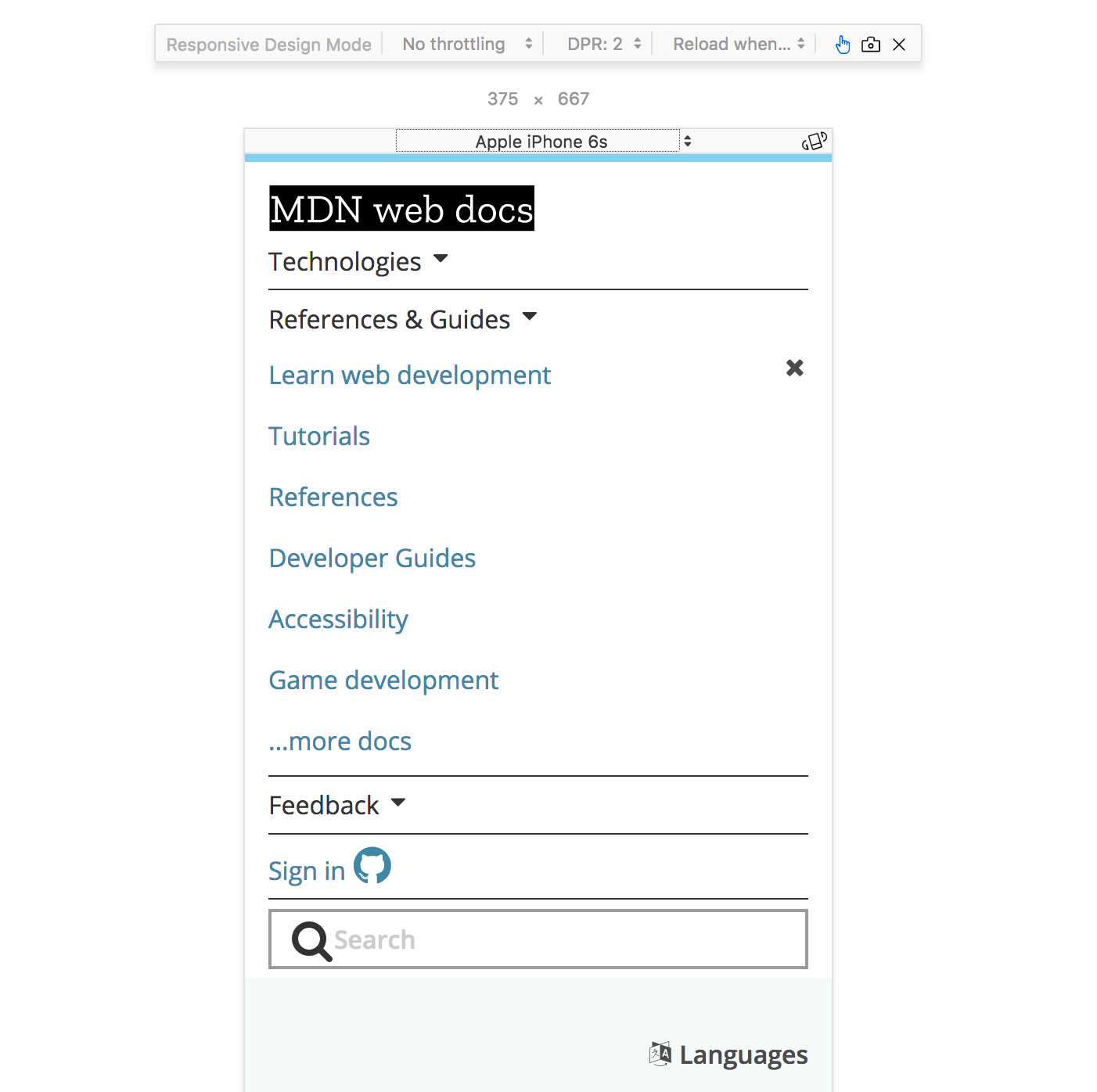
Mobile Device Simulator

Question: Why might this be important?*

@media (some_condition) { }) cause different CSS rules to be applied on different screensThis will make our .nav element position relative when the media type is print
// Default position layout

.nav {
  position: absolute;
}

// Print media only layout

@media print {
  .nav {
    position: relative;
  }
}
Each feature is a characteristic of the user-agent
| Query | Description |
|---|---|
| width | the width of the viewport |
| all | TRUE if the device responds to media queries |
| resolution | Pixel density of the output device |
| color | Number of bits per color component of the device |
| pointer | Is the primary input mechanism a pointing device |
| hover | Does the primary input mechanism allow the user to hover |
Only change the layout to position: relative; when
screen
@media screen and (min-width:768px) {
  .nav {
    position: relative;
  }
}
NOTE: OR is the , (comma) in a Media Query
Only change the layout to position: relative; when
screen
@media screen, (min-width:768px) {
  .nav {
    position: relative;
  }
}
/