Description
buttons, nav bars, drop-downs, breadcrumbs, site maps, anchors, accordions, etc.
Topics
Bootstrap-ComponentsSlides
Bootstrap Components
- Built into Bootstrap are a number of reusable elements, conveniently styled out with accompanying JS to easily add components such as navigations, alerts, dropdowns, buttons, responsive tables, lists, responsive media objects, and more!
- There are over 20 different Bootstrap components that can be found here: https://getbootstrap.com/docs/4.0/components/alerts/
Installation
Components need: - Bootstrap CSS, jQuery, Popper.js, Bootstrap.js
<head>
  <link rel="stylesheet" href="https://maxcdn.bootstrapcdn.com/bootstrap/4.0.0/css/bootstrap.min.css">
  <script src="https://code.jquery.com/jquery-3.2.1.slim.min.js"></script>
  <script src="https://cdnjs.cloudflare.com/ajax/libs/popper.js/1.12.9/umd/popper.min.js"></script>
  <script src="https://maxcdn.bootstrapcdn.com/bootstrap/4.0.0/js/bootstrap.min.js"></script>
</head>
Navs
- A number of different classes help to set various nav styles (tabs, horizontal links, vertical links, active links, disabled links, etc.)
- Nav elements in Bootstrap represent just the navigation links, and not the overall
navbarclass, which adds a wrapper in which you are able to add a logo, links (inside anavelement), styles, and even forms (such as a search bar, for example). - Navigations get much more in depth with various classes, controls, and styles. For more information, visit: https://getbootstrap.com/docs/4.0/components/navbar/
<nav class="nav nav-pills nav-fill">
  <a class="nav-item nav-link active" href="#">Active</a>
  <a class="nav-item nav-link" href="#">Link</a>
  <a class="nav-item nav-link" href="#">Link</a>
  <a class="nav-item nav-link disabled" href="#">Disabled</a>
</nav>
Coloring
- Bootstrap has eight colors designed to indicate to the user what they should do without words
- These colors are added to component classnames and will add the color to the component
- This is customizable
- These colors are:
| Class | Color |
|---|---|
| primary | blue |
| secondary | grey |
| success | green |
| danger | red |
| warning | yellow |
| info | teal |
| light | white |
| dark | dark gray |
Alerts
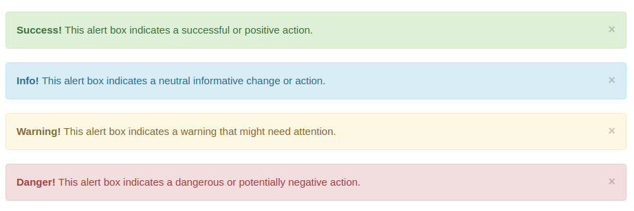
- When an action is completed on your site, such as a form submission, you may want to bring the user to a page with an alert message. To add a role, you can simply include the following code, and change the class.
- Note that the
alertis in addition toalert-primary
<div class="alert alert-primary" role="alert">
  This is a primary alert—check it out!
</div>
- The following classes are available for different colored alerts.
| Class | Alert Color |
|---|---|
| alert-primary | blue |
| alert-secondary | grey |
| alert-success | green |
| alert-danger | red |
| alert-warning | yellow |
| alert-info | teal |

Buttons
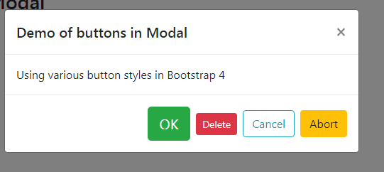
- Similarly, buttons can be added with the same colors. The classes for buttons are similar to the alert classes for continuity. The following code will add a button to your web page:
<button type="button" class="btn btn-primary">Primary</button>
- As you can see, this also uses the language 'primary', as a descriptor. This will result in a button that is the same color as the alert-primary component. The following classes/button styles are available for use in Bootstrap 4:
| Class | Button Color |
|---|---|
| btn-primary | blue |
| btn-secondary | grey |
| btn-success | green |
| btn-danger | red |
| btn-warning | yellow |
| btn-info | teal |
- You can also modify the class so the button is 'hollow', or rather, has a transparent background, with a colored border and text. This is done simply by changing
btn-primarytobtn-outline-primary.
<button type="button" class="btn btn-outline-primary">Primary</button>
- Note that Bootstrap uses the semantic
<button>element, rather than just a div with the class 'btn-primary'. This is necessary for all of the default Bootstrap styling to be applied, so try not to forget! Bootstrap typically uses semantic HTML elements when possible.

Carousel
Bootstrap offers pre-packaged image carousels that can be added to the header (or elsewhere) on your website. This component has a lot of different options and attributes, such as pagination (slide indicators), controls (left/right arrows for scrolling through photos), thumbnails, and captions.
Carousels tend to me a more intricate and complicated Bootstrap component, so lets break down the relatively simple markup below:
<div id="carouselExampleControls" class="carousel slide" data-ride="carousel">
  <div class="carousel-inner">
    <div class="carousel-item active">
      <img class="d-block w-100" src="..." alt="First slide">
    </div>
    <div class="carousel-item">
      <img class="d-block w-100" src="..." alt="Second slide">
    </div>
    <div class="carousel-item">
      <img class="d-block w-100" src="..." alt="Third slide">
    </div>
  </div>
  <a class="carousel-control-prev" href="#carouselExampleControls" role="button" data-slide="prev">
    <span class="carousel-control-prev-icon" aria-hidden="true"></span>
    <span class="sr-only">Previous</span>
  </a>
  <a class="carousel-control-next" href="#carouselExampleControls" role="button" data-slide="next">
    <span class="carousel-control-next-icon" aria-hidden="true"></span>
    <span class="sr-only">Next</span>
  </a>
</div>
- This code will add a carousel, with three different images.
d-blockandw-100are classes that override the default image behavior in your browser, and force the image to be full-width and responsive. - You can see the
carousel-controlelements, which add left and right arrows to the slideshow. - The
sr-onlyclasses are for screen readers. - More classes and attributes for the carousel component can be found at: https://getbootstrap.com/docs/4.0/components/carousel/

Jumbotron
- The jumbotron component adds a hero image to the top of your website. This markup is relatively simple, but very useful, as a majority of websites today use hero images on their homepage.
<div class="jumbotron jumbotron-fluid">
  <div class="container">
    <h1 class="display-4">Fluid jumbotron</h1>
    <p class="lead">This is a modified jumbotron that occupies the entire horizontal space of its parent.</p>
  </div>
</div>
Cards
Cards can be useful when trying to create a blog-like layout, with images and text within the same wrapper.
Cards will appear full width, unless you add additional styles or classes to the card element, such as
col-sm-4.

Cards Code Examples
- This card will appear full width, unless you add additional styles or classes to the card element, such as
col-sm-6. In a previous lesson we covered the column based classes and how to set a given width to a element.
<div class="card">
  <div class="card-header">
    Featured
  </div>
  <ul class="list-group list-group-flush">
    <li class="list-group-item">Cras justo odio</li>
    <li class="list-group-item">Dapibus ac facilisis in</li>
    <li class="list-group-item">Vestibulum at eros</li>
  </ul>
</div>
<div class="card">
  <div class="card-body">
    <h5 class="card-title">Card title</h5>
    <h6 class="card-subtitle mb-2 text-muted">Card subtitle</h6>
    <p class="card-text">Some quick example text to build on the card title and make up the bulk of the card's content.</p>
    <a href="#" class="card-link">Card link</a>
    <a href="#" class="card-link">Another link</a>
  </div>
</div>
Bootstrap Examples and Themes
- Bootstrap offers a number of simple, modular page layouts that you can use and tweak for your own needs. This is certainly helpful for quickly deploying a complete Bootstrap website in a timely manner.
- This way, you don't need to write all the markup from scratch - Bootstrap developers have already done a majority of the legwork for you.
These examples can be found at: https://getbootstrap.com/docs/4.0/examples/
Themes, which are basically fully styled and coded websites, can be purchased from https://themes.getbootstrap.com/. However, I do not recommend this, as you should now be able to replicate just about every theme, using the resources and components above, for free.